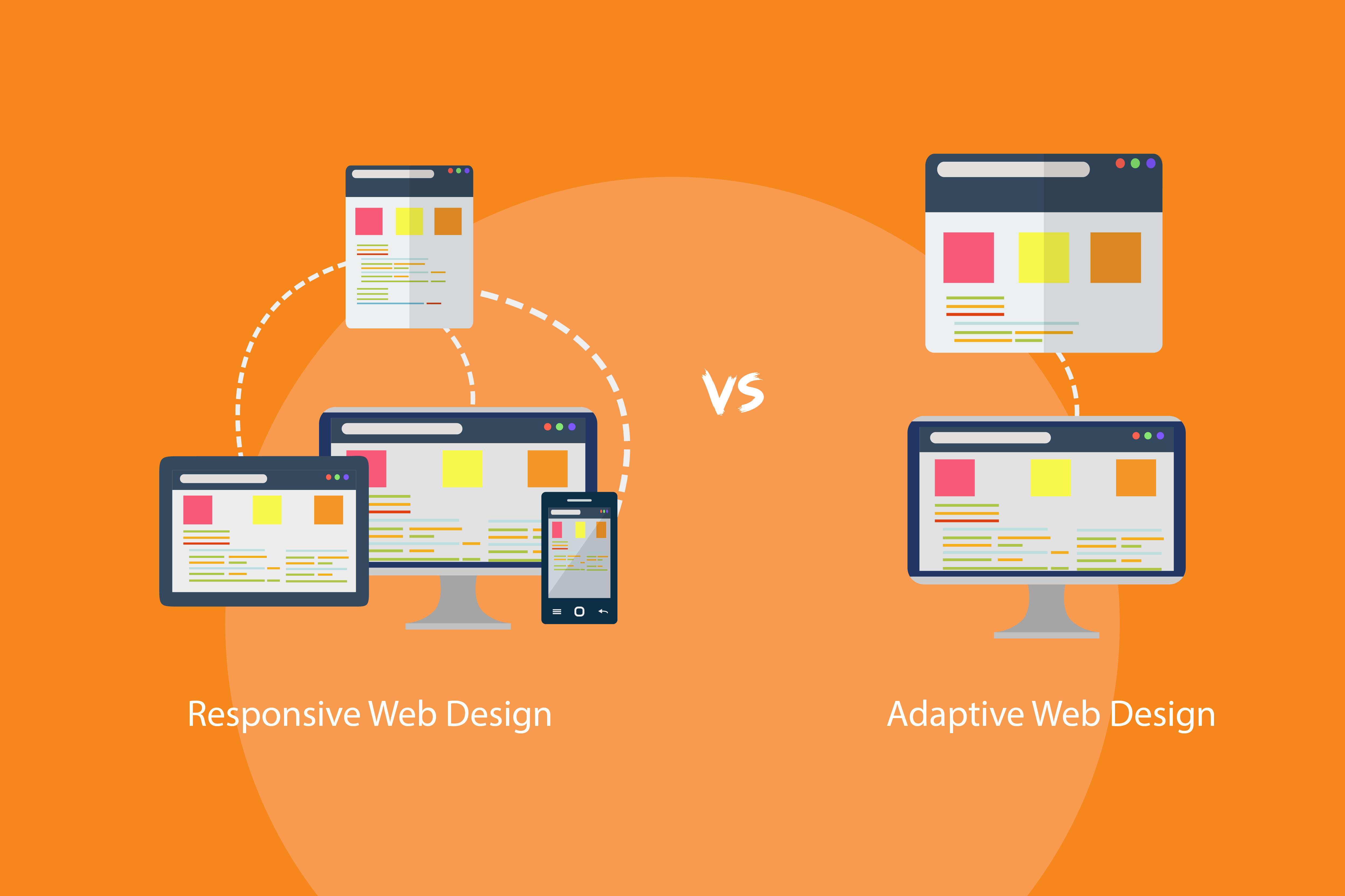
As we enter the period of 2025, Web design has become a transforming process because of new technology expectations and device diversities. In making a website, one of the main points of contention is whether to go with responsive web design (RWD) or adaptive web design (AWD). Both mediums are applied to ensure maximization of user experience from whatever screen sizes or devices users are accessing them; the difference lies with how they go about it. Let us take a peek into both methods and see which of them are more likely suitable by 2025 for general web development.
Responsive Web Design: The Flexible Approach
After some years in practice, responsive web design is still very much alive in the year 2025 because it is flexible and not difficult to work with. RWD is a fluid principle. In other words, the layout and content of the website will literally change instantaneously with the size of the screen from which the pages are viewed.
The Working of Responsive Web Design Feature and Benefits Generally:
Fluid Grids: Responsive design relies on fluid grids whose contents are set to scale based on the screen size of the device. This makes the layout resize neatly without the distraction of breaking usability.
Flexible Images: In RWD, images are flexible–responsive images with their size being adjusted up or down proportionately to avoid pixelization or cropping on untimely resolutions.
Media Queries: They are the nerve center of RWD. Using media queries, one can apply different CSS rules based on the characteristics of the device (for example, screen width and resolution) so that the design maintains its integrity across all devices.

Why Is RWD Still Relevant in 2025?
Responsive layout continues to be used and trusted for many reasons:
One Layout for All Devices: The foremost advantage of RWD is that it presents one design solution for all devices. The designer only has to maintain one version of the website, which, in turn, makes it easy to update and optimize.
Mobile-First Thinking: With mobile web traffic taking the lead, RWD is centered on how the site appears on mobile devices, which is fundamentally faster and more pleasing.
SEO-Friendly: Google ranking criteria favor responsive websites since all content resides under one URL, thus increasing rankings and ease of indexing.
Cost: RWD is often the cheaper and faster approach compared to other methods. With RWD, developers do not need to create different layouts for different screen sizes, which results in a considerable reduction in development time and maintenance costs.
Responsive web design vs Adaptive Web design [Video Link]
Adaptive Web Design: A Tailored Experience
The adaptive web design method delivers different layouts to users by deducing their device specifications and screen dimensions. AWD provides different fixed layouts across multiple screens because it serves specific formats to detected devices.
Adaptive Web Design includes the following main characteristics:
Designers in AWD create multiple fixed layouts which correspond to different screen dimensions within the system. Web developers design special layouts for individual devices including handheld smartphones and tablet computers together with desktop PCs.
The website employs device detection through JavaScript or server-side scripting techniques to identify the type of device users access from before providing matched layouts for that specific device.
Every layout within AWD functions as a specialized design for distinct groups of devices. The system enables developers to achieve detailed modifications of screen content display for select screens.
When to Use Adaptive Web Design in 2025
The web design world accepts adaptive design for situations where personalization in the user experience stands as essential. The “one-size-fits-all” method of responsive design can be supplemented by using Analytical Web Design which provides several advantages.
Companies using AWD can specify distinct customizations for individual devices in order to control their design and user interactions. Developers optimize layouts by designing specific versions for each device since this approach creates presentations that match intended formats.
The loading speed increases through adaptive design because it avoids downloading additional content which is not required for fitted device layouts. Striking websites that demand high performance gain significant benefits from this approach.
The capability to support older devices and browsers through adaptive design exists because it handles responsive design limitations in these devices. The detection of legacy devices through AWD maintains user experience by eliminating display problems.
The design method grants developers a higher level of control allowing them to shape UX appearance across various devices. Highly interactive websites along with websites needing exact design details benefit significantly from this feature.
Which One is Right for You
Random design selection in 2025 between responsive web design and adaptive web design depends on your project requirements.
A decision between responsive and adaptive web design approaches must be made to build your website for 2025. Your selected project requirements will determine whether adaptive or responsive web design suits your project.
The selection process between responsive web design starts from here but it depends on your project requirements.
RWD provides optimal outcomes to developers who require one design that automatically adjusts to no matter what device users employ. The solution provides a single adjusted experience which functions identically on desktop as well as tablet and mobile platforms.
Websites with basic operations should adopt RWD since it delivers an instant simple option.
The use of RWD allows better SEO management because it employs a single URL structure that applies to every device.
What Are the Indications for Choosing Adaptive Web Design?
You should use AWD because specific device optimization needs for your website exists. Complex layouts and specific-targeted devices make AWD a superior option as a design solution.
Adaptive design enables faster loading times since it sends only required content to users based on their selected device. Development using this approach offers the best performance benefits for websites that need maximum optimization.
AWD serves as an ideal solution to support outdated devices which tend to display limited capabilities when dealing with contemporary responsive design strategies.

The Hybrid Approach: Combining RWD and AWD
The fusion of adaptive web design and responsive web design elements is now on the rise among developers who pursue their benefits. The largest websites usually begin with responsive design structure and enhance it with adaptive elements optimized for particular hardware types. The website structure comes from RWD yet some content-related components such as images and features receive adaptive treatment for tablet and desktop views.
A hybrid design strategy will become a strategic choice for delivering the best user experience across all devices in the year 2025.
Click Here to Check Latest Gadgets
Conclusion
Thus for 2025 you should decide between responsive and adaptive web design based on your strategic goals alongside the website complexity level and user demographics. Most businesses currently benefit from selecting responsive web design since it offers complete adaptability alongside search-engine friendliness and universal usability. Websites that need highly customized experiences will benefit the most from adaptive web design even though it delivers enhanced performance according to its specifications.
A solution must be chosen according to the precise needs of your individual project. It is essential to monitor technological developments and choose the optimal method for creating an integrated engaging UX for your users.


